A map, in its most basic form, is a snapshot. It freezes a landscape, a city, or a country at a single moment, presenting a static portrait of a place. But our world is anything but static. Coastlines erode, cities expand, forests burn, and people move. So how do we map a process? How do we capture the relentless, invisible march of time on a flat piece of paper or a glowing screen?
Welcome to the fascinating world of chronocartography—the art and science of mapping change over time. It’s the practice of adding the fourth dimension, time, to the traditionally two- or three-dimensional world of maps. By doing so, cartographers transform static documents into dynamic narratives, revealing patterns and telling stories that would otherwise remain hidden.
The Challenge of the Fourth Dimension
The fundamental challenge is simple: maps represent space, not time. To overcome this, geographers and data visualization experts have developed a range of ingenious techniques. These methods don’t just show a “before and after”; they illustrate the very process of change, whether it happens over minutes, decades, or millennia.
Classic Techniques in a Modern World
Some of the most effective methods for mapping time have been around for centuries, but they remain powerful tools for understanding our world.
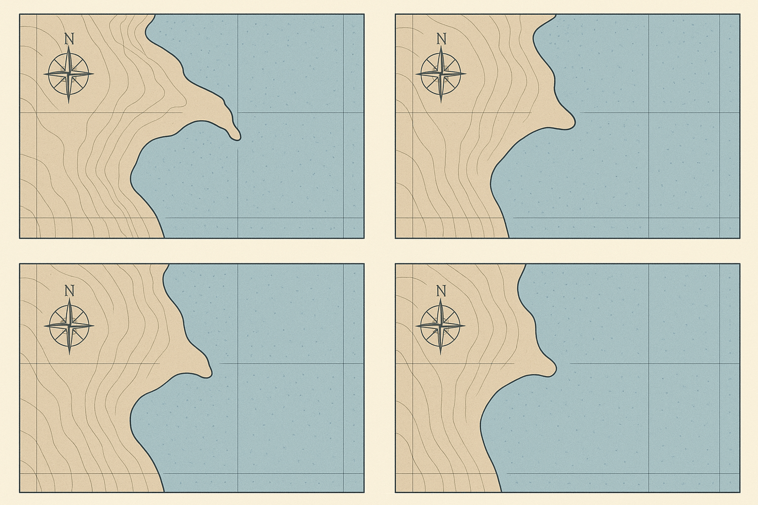
Small Multiples: The Story in Sequence
One of the most straightforward techniques is the use of “small multiples” or sequential maps. This involves creating a series of maps of the same geographic area at different time intervals, placed side-by-side. The viewer’s eye can quickly scan across the series to see the transformation.
- The Shrinking Aral Sea: A series of maps of the Aral Sea from 1960 to the present day tells a devastating story of environmental mismanagement. The vast blue expanse of the 1960s map shrinks dramatically in each successive frame, becoming a few disconnected puddles by the 2010s. The sequence is more powerful than any single map could ever be.
- Urban Sprawl: Planners often use sequential maps to visualize the growth of a city like Las Vegas or Dubai. A map from 1980 might show a compact urban core, while subsequent maps for 1990, 2000, and 2010 show the explosive, tendril-like growth of suburbs into the surrounding desert.
The Masterpiece of Static Chronocartography
Perhaps the most famous single example of chronocartography is not a series, but a single, breathtakingly complex chart. Charles Joseph Minard’s 1869 map of Napoleon’s disastrous Russian campaign of 1812 is a masterclass in data visualization.
On one sheet, Minard plots multiple variables over time:
- The size of Napoleon’s army, represented by the thickness of a band.
- The army’s geographic path, moving from the Polish border to Moscow and back.
- The direction of movement (tan for the advance, black for the retreat).
- The brutal temperatures on the retreat, linked to dates on a separate graph.
The story is stark. A thick, tan ribbon showing 422,000 men dwindles to a sliver as it reaches Moscow. The retreat is a thin black line that shrinks to almost nothing, representing the mere 10,000 who survived. It’s a tragic symphony on a single sheet of paper, a powerful chronocartographic narrative.
Digital Dimensions: Animation and Interaction
The digital age has revolutionized chronocartography, allowing for animation and user interaction that Minard could only have dreamed of. Digital maps can bring time to life in ways static maps cannot.
Animated Maps
Animation turns a sequence of maps into a fluid movie. By animating data over a basemap, we can see processes unfold in real-time or as a time-lapse.
- Physical Geography: An animated map can show the path and intensity of a hurricane as it moves across the ocean and makes landfall, with colors changing to represent wind speed. We can watch the spread of a forest fire hour by hour or see centuries of glacial retreat happen in seconds.
- Human Geography: Imagine a map of the world that animates the spread of humanity out of Africa over thousands of years. Or a 24-hour animation of global air traffic, showing the world’s continents lighting up with flight paths as day turns to night. These maps reveal the planet as a living, interconnected system.
Interactive Maps
Interactive digital maps empower the user to become the explorer. By incorporating a time-slider, users can manually move back and forth through time to compare specific moments. They can click on features to get more information, or toggle different data layers on and off. This is common for visualizing climate change data, demographic shifts in a city, or changing political boundaries over the 20th century.
Abstracting Time: Warping Space Itself
Some of the most mind-bending chronocartographic techniques don’t just add a time-slider; they fundamentally remap space based on time.
Isochrone Maps: Mapping by Minutes, Not Miles
An isochrone map shows areas that are reachable from a starting point within a certain timeframe. The resulting shapes are not based on distance but on travel time. These maps brilliantly visualize the impact of transportation infrastructure.
For example, an isochrone map centered on central London in 1890 would show a small, walkable core for the 30-minute travel zone. A modern map for the same 30-minute zone would be a sprawling, star-shaped entity, its long arms following the paths of the Tube lines. It warps familiar geography into a new shape, one defined not by miles, but by minutes, perfectly illustrating how technology has shrunk our world.
A Storyteller’s Most Powerful Tool
Chronocartography is more than a technical exercise; it’s a form of storytelling. It allows us to bear witness to the slow, inexorable change of a coastline, the rapid and chaotic growth of a city, or the tragic journey of an army. It gives geography a heartbeat, revealing the processes that shape our planet and our lives.
By learning to map the fourth dimension, we gain a deeper understanding of the past, a clearer view of the present, and a better-informed vision of the future. The next time you see a map, ask yourself not just “Where is this?” but also, “When is this?”—and you’ll start to see the world in a whole new dimension.