****
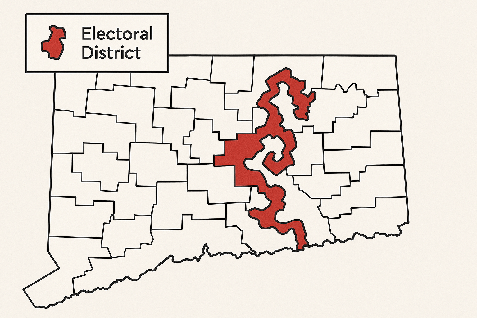
Look at a map of U.S. congressional districts, and you might see something strange. Sandwiched between neat, blocky counties, you might find a district that twists and writhes across the landscape like a spilled drink. You might find one shaped like earmuffs, another like a praying mantis, or a third so long and thin it’s been nicknamed “the snake by the lake.” These are not accidents of geography; they are deliberate, carefully crafted creations. This is the art and science of gerrymandering—a cartographic practice where politicians choose their voters before the voters ever get a chance to choose them.
The Original “Gerry-mander”
To understand this phenomenon, we have to travel back to 1812 Massachusetts. Governor Elbridge Gerry, seeking to secure his Democratic-Republican party’s control of the state senate, signed a bill that redrew the electoral districts into very strange shapes. One district in Essex County was so contorted that it prompted a Federalist newspaper to publish a political cartoon mocking its shape. An editor, looking at the creature-like outline, remarked that it looked like a salamander. Another quipped, “Better to call it a Gerry-mander!”
The name stuck, forever linking Governor Gerry to the practice of manipulating geography for political gain. At its core, gerrymandering is the process of drawing electoral district boundaries to give one political party an unfair numerical advantage over another. It turns the democratic principle of “one person, one vote” on its head, creating a system where the geography of the map matters more than the will of the people.
The Geographer’s Toolkit for Manipulation: Cracking and Packing
Redistricting, the process of redrawing these lines, is a necessary part of representative democracy. It happens every ten years after the U.S. Census to account for population shifts. However, when the party in power controls this process, they have two primary geographic strategies at their disposal: packing and cracking.
Packing: The Overstuffed District
Packing involves concentrating the opposing party’s voters into as few districts as possible. Map-drawers will create a handful of districts that the opposition will win by overwhelming margins—say, 80% to 20%. While the opposition celebrates a landslide victory in these packed districts, their votes are effectively “wasted.” The excess votes do nothing to help their party win in neighboring areas. The dominant party then wins the surrounding districts by slimmer, but still comfortable, margins (e.g., 55% to 45%), ultimately securing more seats overall.
Cracking: The Diluted Vote
Cracking is the opposite strategy. It involves taking a large concentration of opposition voters and “cracking” them apart, spreading them thinly across many different districts. By diluting their voting power, you ensure they can never form a majority in any single district. Their votes are still cast, but they become a permanent minority in numerous districts, unable to elect their preferred candidates. A cohesive community that might have formed its own district is instead split between three or four, rendering its collective voice powerless.
A Gallery of Geographic Absurdities
These techniques have produced some of the most bizarrely shaped districts in the country, each a masterpiece of political cartography.
- Illinois’s 4th District (“The Earmuffs”): For years, this district in Chicago was famously shaped like a set of earmuffs. It consisted of two dense Hispanic population centers connected by a thin sliver of land that ran along an interstate highway. The design ensured the district would elect a Hispanic representative, but its shape demonstrates the extreme lengths map-drawers will go to in order to group specific demographics while excluding others.
- Maryland’s 3rd District (“The Praying Mantis”): Often cited as one of the most gerrymandered districts in the nation, this district sprawls across multiple counties, connecting disparate parts of Baltimore, Annapolis, and suburban areas. It has been described as a “broken-winged pterodactyl, lying prostrate across the center of the state.” Its shape was drawn with one goal in mind: to pack in as many registered Democrats as possible, creating a safe seat for the party.
- North Carolina’s 12th District (pre-2016): Before being struck down by courts, this district was a prime example of a “snake” district. In some places, it was no wider than the I-85 highway it followed for much of its length, weaving through cities to scoop up African American communities into a single, heavily Democratic district.
When Geography Distorts Democracy
The consequences of gerrymandering extend far beyond strange maps. By creating “safe” districts, the practice drains competition from the political system. The real election is not the one held in November, but the one that happens behind closed doors in the map-drawing room. This leads to several negative outcomes:
- Increased Polarization: When a representative knows their district is safely Republican or safely Democrat, they have no incentive to compromise or appeal to the other side. Their biggest threat is a primary challenge from a more extreme member of their own party, pushing politicians further to the ideological poles.
- Reduced Accountability: Incumbents in gerrymandered districts are incredibly difficult to unseat, regardless of their performance. They are accountable not to the general electorate, but to the party base that keeps them in power.
- Eroded Public Trust: When voters see a system that feels rigged and districts that don’t represent their actual communities—sometimes splitting cities or even neighborhoods in half—they become cynical and disengaged, feeling that their vote doesn’t matter.
Geographers to the Rescue: Fighting Fire with Maps
For decades, gerrymandering was a dark art practiced with paper maps and demographic tables. But today, the very tools that enable sophisticated gerrymandering are also being used to fight it. Geographers, data scientists, and mathematicians are at the forefront of the battle for fair maps.
Using Geographic Information Systems (GIS), experts can now analyze millions of potential map configurations in minutes. They can generate maps based on non-partisan criteria, such as keeping counties and cities whole, creating compact shapes, and promoting competitive elections. These computer-generated maps serve as a neutral baseline to compare against partisan proposals.
Furthermore, academics have developed new statistical tests to measure the fairness of a map:
- Compactness Scores: Mathematical formulas like the Polsby-Popper test can be used to objectively measure how contorted a district’s shape is. While not a perfect measure of fairness, it can flag districts that are geographic outliers.
- The Efficiency Gap: This widely cited metric calculates the number of “wasted votes” (votes for a losing candidate or excess votes for a winning candidate) for each party across a state. A large efficiency gap indicates that one party’s voters are being systematically packed and cracked, giving the other party an unfair advantage.
This geographic and data-driven approach is empowering courts to strike down unfair maps and supporting calls for reform, such as the implementation of independent redistricting commissions. These commissions, used in states like California and Arizona, take map-drawing out of the hands of politicians and give it to a balanced, non-partisan group of citizens, often advised by geographers and demographers.
The fight over gerrymandering is a fight for the geographic soul of democracy. It reminds us that maps are not just static representations of land; they are powerful documents that define communities, allocate power, and shape our political future. And as long as there are those who would draw lines to divide and conquer, there will be geographers using their own tools to draw them back together.
**