Every world map you’ve ever seen is a lie. This isn’t a conspiracy theory; it’s a cartographic fact. The act of taking our three-dimensional, spherical planet and squashing it onto a two-dimensional, flat surface is a geometric impossibility without introducing some form of distortion. The question is never if a map lies, but how it lies—and more importantly, why.
For centuries, one map has dominated classrooms, newsrooms, and our collective imagination: the Mercator projection. But its familiar shapes tell a powerful, politically charged story. By contrasting it with a radical alternative, the Gall-Peters projection, we can uncover how the lines on a page can shape our understanding of power, importance, and our very place in the world.
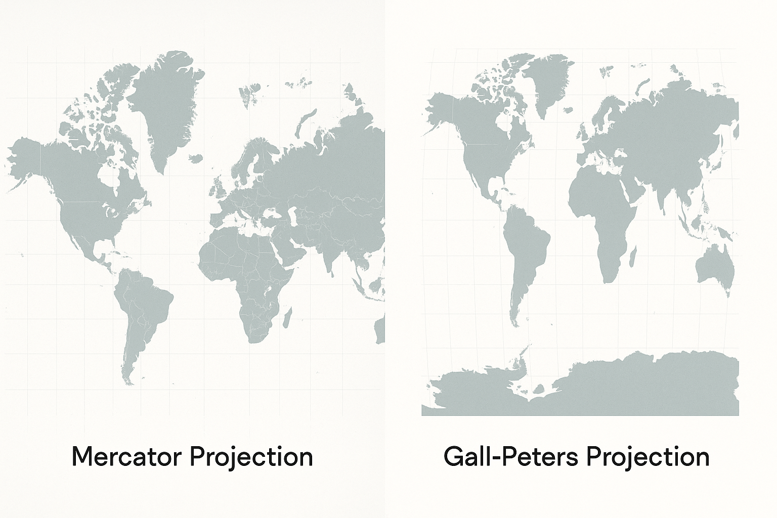
The Familiar World: Mercator’s Enduring Legacy
In 1569, the Flemish cartographer Gerardus Mercator created a revolutionary map. His goal was purely practical: to aid maritime navigation. The Mercator projection’s genius is that it preserves angles. Any straight line drawn on his map is a line of constant compass bearing, allowing a sailor to plot a course from Lisbon to Rio de Janeiro and follow it without constantly adjusting their direction.
To achieve this navigational feat, Mercator had to make a significant sacrifice: area. As you move away from the equator and towards the poles, landmasses on his map are stretched and grotesquely exaggerated. This leads to some famous distortions:
- Greenland vs. Africa: On a Mercator map, Greenland appears roughly the same size as Africa. In reality, Africa is 14 times larger.
- Europe vs. South America: Europe (excluding Russia) appears larger than South America. In truth, South America is nearly twice the size of Europe.
- Alaska vs. Mexico: Alaska looks about three times bigger than Mexico. In fact, Mexico is slightly larger than Alaska.
For centuries, this was simply the “world map.” Its navigational utility made it indispensable during the Age of Exploration and colonial expansion. But its side effects were profound.
The Politics of Distortion: A Eurocentric Worldview
The Mercator projection, by design and by consequence, promotes a Eurocentric view of the world. Europe is placed squarely in the center of the map. More significantly, the massive exaggeration of landmasses in the Northern Hemisphere visually inflates the size—and perceived importance—of Europe and North America. Meanwhile, nations in Africa, South America, and Oceania, which constitute the “Global South”, appear shrunken and less significant.
While Mercator’s intent was not colonial propaganda, his map became the visual backdrop for an era of European imperialism. It presented a world where the colonial powers of the north literally loomed over the colonized lands of the south. This visual hierarchy, taught to generations of schoolchildren, subtly reinforces notions of power and development. When we see a country as physically large, we may subconsciously associate it with greater importance. The Mercator map, in effect, “centered” and “enlarged” the world of its creators.
Enter the Challenger: The Gall-Peters Projection
In the 1970s, a German historian named Arno Peters held a press conference to decry the “deceptive” and “imperialist” nature of the Mercator map. He unveiled what he presented as a superior alternative: the Peters projection, a map that corrected these colonial-era biases.
What became known as the Gall-Peters projection (crediting an earlier, similar design by James Gall in 1855) is an equal-area projection. Its defining feature is that it represents all landmasses with their correct relative size. On the Gall-Peters map, Africa is restored to its true, immense scale, dwarfing Europe and Greenland. South America appears as the vast continent it is. The world looks startlingly different—uncomfortably stretched and squashed to many, but geographically honest in its proportions.
Peters argued that his map was a matter of social justice. By showing the true size of developing nations, he contended, the map gave them their rightful place on the world stage, challenging the visual dominance of the Global North. His argument was persuasive, and aid organizations like UNESCO and various school districts adopted the Gall-Peters map to provide a more equitable worldview.
A Map with a Mission—and Its Critics
The Gall-Peters projection was not without controversy. Many professional cartographers were incensed. They criticized Peters for his aggressive marketing, for presenting a 19th-century projection as his own invention, and for creating a false dichotomy: the “bad” Mercator versus the “good” Peters.
Cartographers pointed out that while the Gall-Peters map preserves area, it does so at the cost of shape. Countries near the equator are stretched vertically, while those at the poles are squashed horizontally, making them barely recognizable. They also noted that dozens of other equal-area projections exist, such as the Mollweide or Eckert IV, which many feel offer a better compromise between accurate area and reasonable shape.
The critics’ point wasn’t that the Mercator was perfect, but that the Gall-Peters was also a deeply flawed representation of the globe. Its primary value wasn’t cartographic elegance, but its powerful political statement.
Beyond Two Maps: A World of Projections
The fiery debate between Mercator loyalists and Gall-Peters advocates highlights the central truth of mapmaking: every map is a tool designed for a specific purpose.
- A Mercator projection is the right tool for a sailor navigating by compass but the wrong tool for understanding the relative size of continents.
- A Gall-Peters projection is a good tool for demonstrating area equality but a poor tool for navigating or appreciating the true shapes of countries.
Today, many organizations have moved towards “compromise” projections. Since 1998, the National Geographic Society has used the Winkel Tripel projection for its world maps. The Winkel Tripel doesn’t perfectly preserve area, shape, or direction, but it minimizes all types of distortion, offering a balanced and visually pleasing view of the world. It’s a pragmatic solution that acknowledges no flat map can be perfect.
Why Your World Map Matters
The story of the Gall-Peters bias is more than just a technical dispute. It’s a powerful lesson in critical thinking. It teaches us that maps are not passive windows onto the world; they are authored documents, shaped by purpose, history, and perspective.
The next time you look at a world map, don’t just see land and water. Ask questions. What is being distorted to show me this view? What is at the center, and what is on the periphery? What story is this map trying to tell me? By understanding that every map tells a lie, we get one step closer to seeing the world as it truly is: complex, multifaceted, and far too grand to ever fit perfectly on a single sheet of paper.